
Brand and print design case study
The Dillenburg Town Fire: 300 Years
An exhibition identity that works across posters, flyers and other printed materials.

CustomerExhibition 300 Years of the Dillenburg City Fire
SectorCulture and Exhibition
LocationDillenburg
Project2023
Starting point
What the client needed
The priority was preparing a sensitive historical topic with high attention, dignity and consistency for different event media.
Project images
A closer look at the work



Design and development
How we approached it
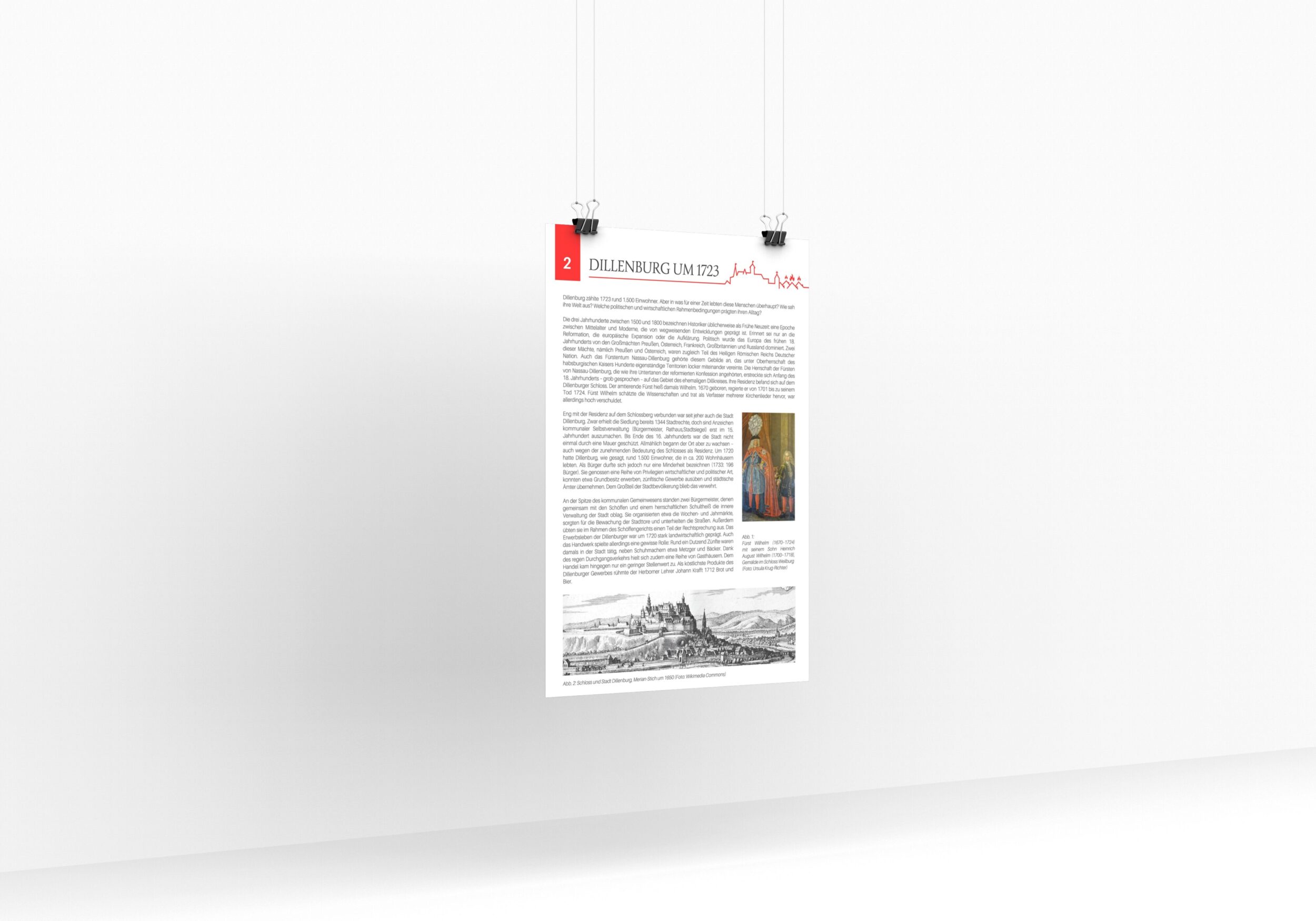
We applied the exhibition logo, imagery and typography to posters, flyers and display panels. The work included exhibition panels and a companion sign for the audio material. Each format was prepared for print.
Project services
- Exhibition logo
- Pressure precursor
- Flyers
- Key visuals
- Posters
- Promotional materials
Result
What the project delivered
A recognizable exhibition identity that combines historical significance and contemporary mediation and makes the anniversary visible in the cityscape of Dillenburg.
Your project